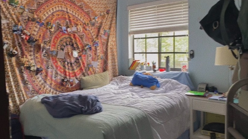
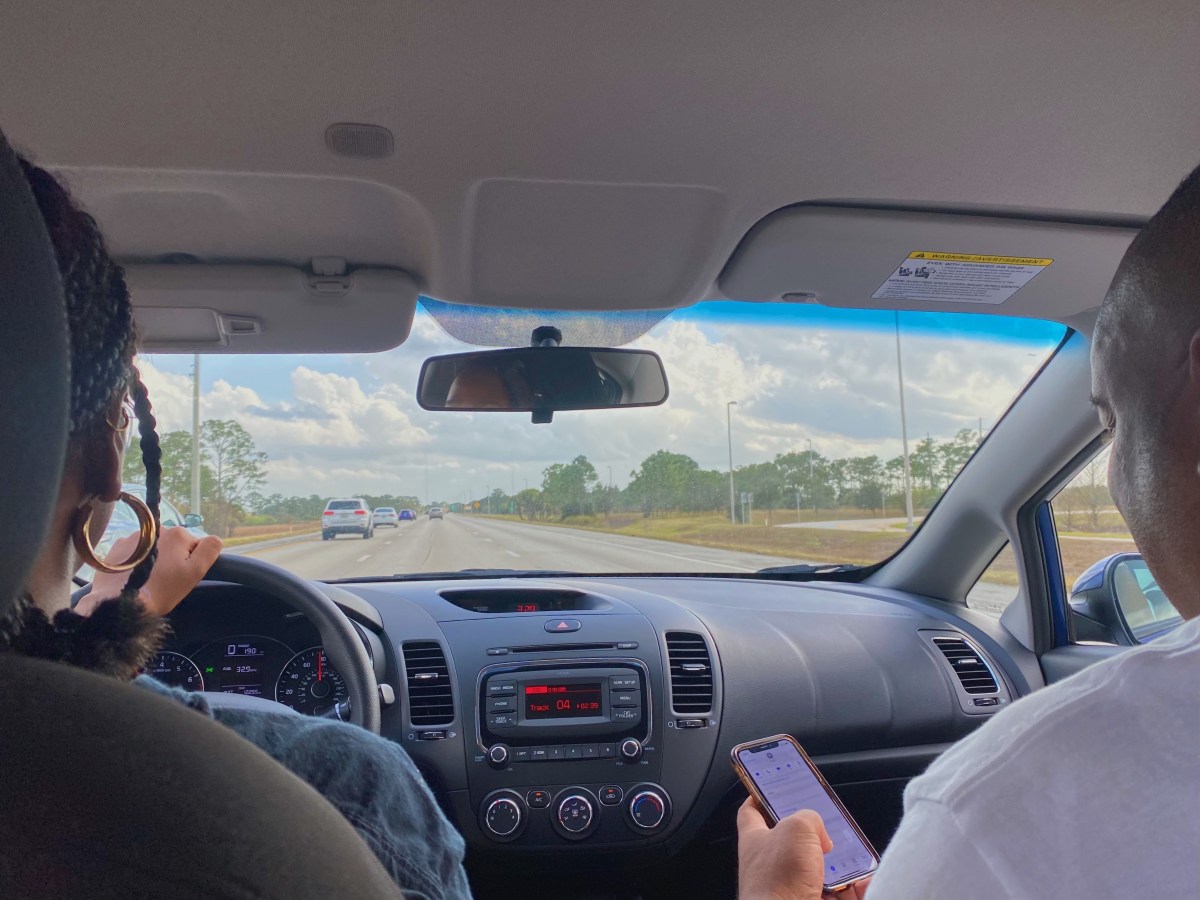
If I had to encapsulate this video in a single sentence that would be it. I’ve learned to appreciate my room more than ever before during the past year as we entered lockdown and then quarantine. In high school, I was constantly out of the house doing one thing or another. Thus, I treated my room as simply a place to sleep and nothing else.
However, COVID-19 has forced me to appreciate this sanctuary that I have built for myself. So much so that it is now my favorite place in my house (beating the previously reigning champ, my kitchen). This video is a love letter to the place I go when I need to unwind. Cry. Laugh. Vent.
It’s a shame it took a global pandemic to realize a good thing that was here the whole time. Better late than never, right?
This week, we’re talking cleanliness. As simple as a concept as this may seem to you and I, for others, it’s a little more complicated. In my integrated media piece, I explore the incredibly strange but fascinating phenomenon of (White) people not washing their legs in the shower.
I hope this was as shocking to y’all as it was to me. What’s even more shocking is the idea that Black people are still seen to be dirty based on historic racial stereotypes even though we are the ones out here actually washing our entire bodies! Shaking my head.
The full piece can be read here and downloaded below.
This week, I embarked on the incredible journey of mastering the art of infographics.
For those who are unaware, an infographic is a comprehensive visual that informs an audience on some topic or phenomenon. Good infographics clearly educate in a way that is aesthetically pleasing. This means that most infographics do not use too many words. Instead, they rely on charts, graphs and visual representations of data to tell the story.
As for making my own infographic, there were some key points that I kept in the front of my mind. The first being: do not over-clutter your infographic. There is nothing worse than a graphic where every single inch of space is covered in either text or image. When I view a graphic design that is visually overwhelming, I am in no way whatsoever inspired to continue reading. Since this is the very last response I would want from my audience, I specifically focused on relaying just the right amount of information.
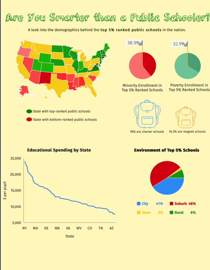
The topic of my infographic is public schools, particularly top-ranked public schools. By the way the characters in this gif are throwing their papers, I think it’s safe to assume this school was not included in the top rankings. Via Giphy.
This was a little challenging given my infographic topic was exploring the demographics behind the top ranked public schools in the nation. As you can likely presume, there are a lot of demographics that accompany national school rankings. Thus, my job was to figure out what exact message I wanted to focus in on, and only provide statistics that corresponded with that narrative.
For my graphic, I chose to highlight how minorities and the poor tend to get the short end of the stick when it comes to quality education. I did this by showing the small percentage of minority students in the top 5% nationally ranked public schools. Of hundreds of schools, only around 30% of them had a minority enrollment of 25% or more. As disappointing as this statistic is, it was unfortunately not surprising to me.
I went to quite a highly ranked high school and it was no secret that our student population was majority White. Thus, the fact that this is a nationwide trend is not something I didn’t see coming. The hard truth is that oftentimes minorities do not have access to the same resources as their White counterparts, which means they are stuck with institutions of lesser quality and no access to a better alternative.
When looking at the data for minority enrollment of at least 50% in these top institutions, the numbers are even more sad with a percentage of around 20%. This means that the overwhelming majority of students in these top schools all look the same for the most part. As diverse as this country is, it’s a shame to see only one race get the majority of access to the ingredients for success and prosperity.
I also highlighted the role of money in good education as my graph showed that the states with the highest ranking schools were the same states who spent the most on education funding. Hence, in order for a school to do well, the state has to be willing to invest in its education system. This explains why poorer states in the South were towards the bottom of the ranking while richer states like New York were towards the top.
I was actually quite surprised at the disparity between the differences in state funding per student. At the higher end of the spectrum, the numbers climbed near $20,000 (per student) while other states spent less than $10,000. This gap brings to light how some students are put on uneven playing fields from the very beginning of their academic careers.
While students in affluent areas are receiving the benefits of thousands of dollars invested in them, students with less state funding must settle for the few resources available. This puts differences in academic performance into perspective as it is easy to see how someone with access to thousands of dollars of technology has the potential to perform much better than a student who can barely afford school supplies.
This is my face when I learned how much minorities and students in poverty are at an educational disadvantage compared to their White, rich counterparts. Via Giphy.
Finances continued to play an important role in the demographics behind the students at these top-ranked schools. Just as minorities were few few in number at these schools, so was poverty enrollment. I included the statistic showcasing that the poverty enrollment in the top 5% ranked schools was around 30%. This means the majority of the students in these high-ranking schools do not come from poverty which hints that social status and financial income play a big part in the quality of education.
For those in poor living situations, it is much harder for them to afford the luxury of quality education. Oftentimes, highly-ranked schools require a sizable tuition payment which is something not everyone can afford, especially when other expenses like groceries and rent are at the forefront. Even top-ranked public schools without a tuition requirement are often in high-income neighborhoods or communities, making them less accessible for someone who lives in a poorer community and does not have the means to travel for a better education.
Throughout the whole process, I learned more about what it takes to be a top-ranked school and gained a better understanding of what type of students are at these schools.
In this vlog, I discuss my recent learnings on all things infographics. Although I was familiar with infographics before, my latest assignment of making an infographic from scratch taught me more about the ins and outs of infographic making.
For example, I learned that you want your visuals to be as aesthetically appealing as possible, so that you can lure audiences into reading more. In making my own infographic, this was definitely the hardest part for me as I had to figure out how to relay so much information in a way that was not confusing or visually overwhelming.
In this video, I discuss what I learned about infographics and how I applied this new knowledge to making my own graphic design.
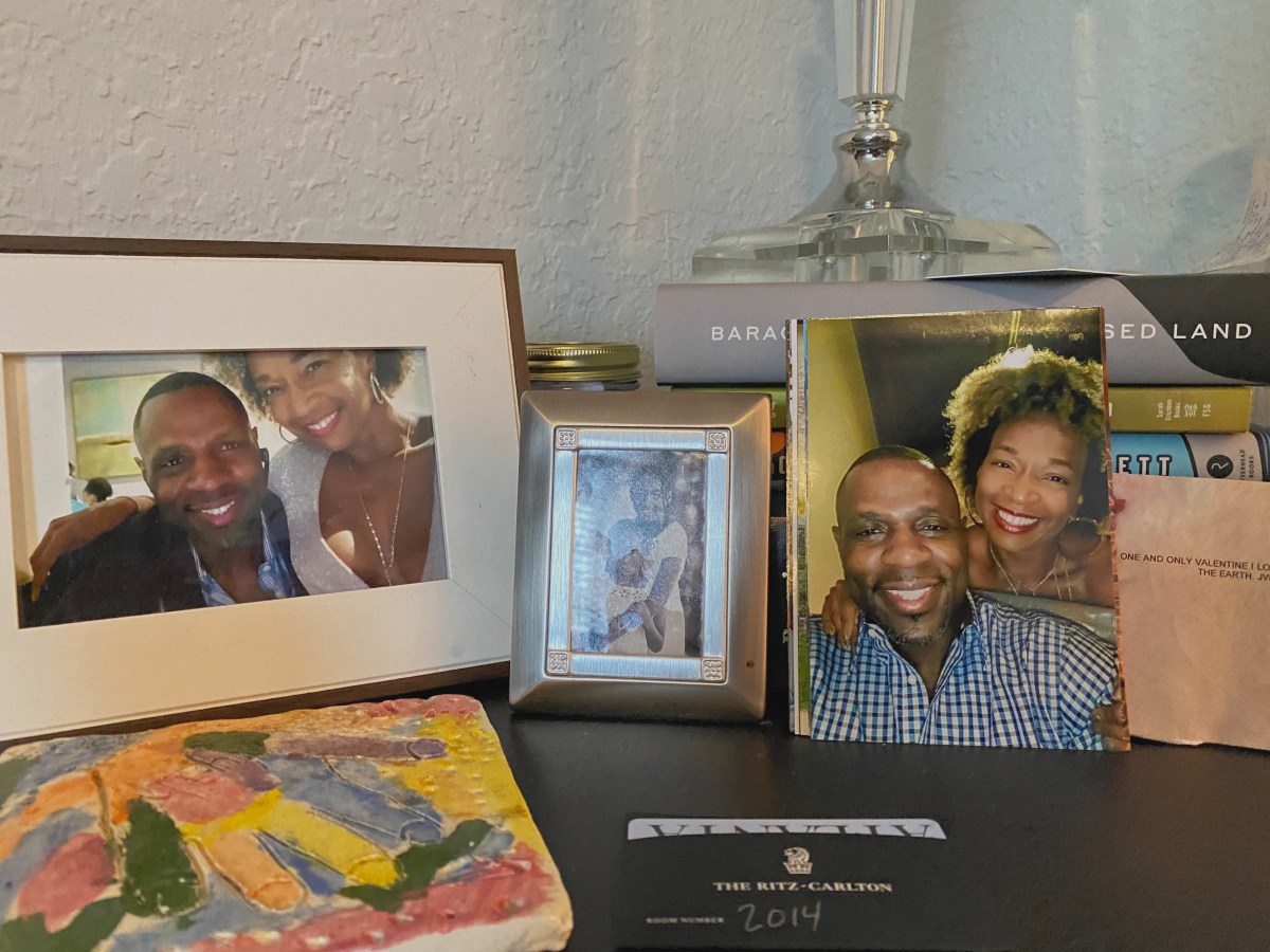
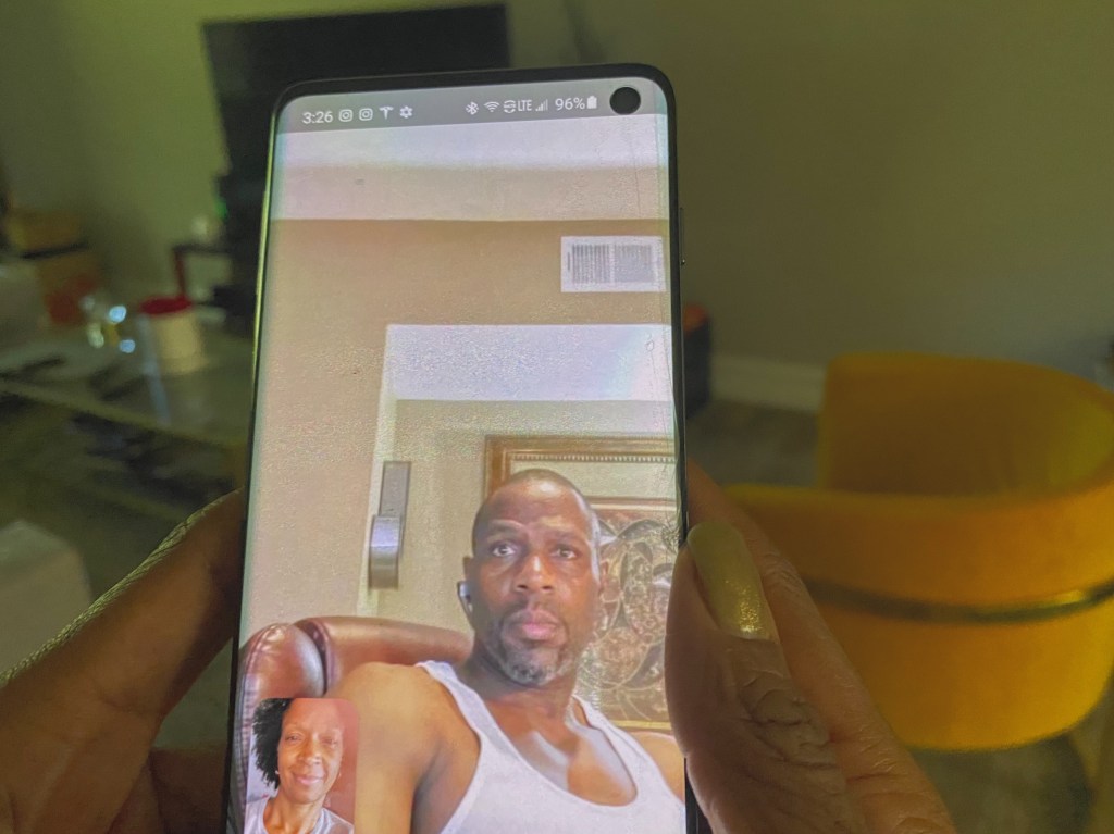
In this interactive photo essay, I explore my mother’s long-distance relationship with her boyfriend, Jermaine. Even though Jermaine lives in St. Louis, thousands of miles away from our home in South Florida, my mother’s relationship with him is stronger than most I have seen. Through sentimental gifts, occasional getaways and the power of technology, my mother and Jermaine make the distance seem like nothing at all.
This unique “computer love” has come to define their relationship, making them look and act a little different than your average pairing. However, even with a phone screen between them, they are still the most adorably corny couple I have ever met. Allow me to explain.
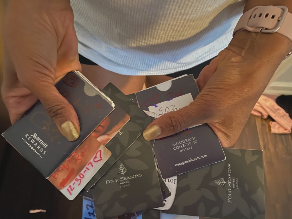
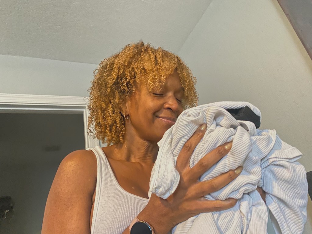
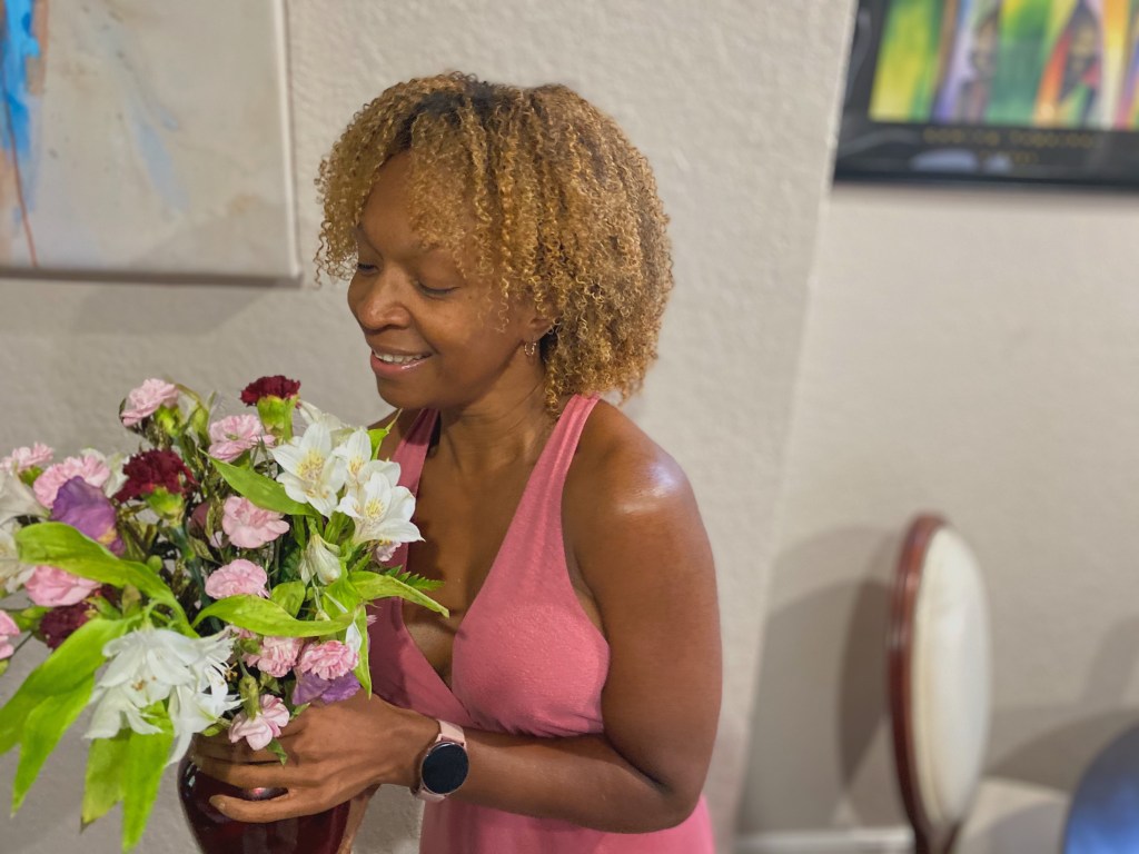
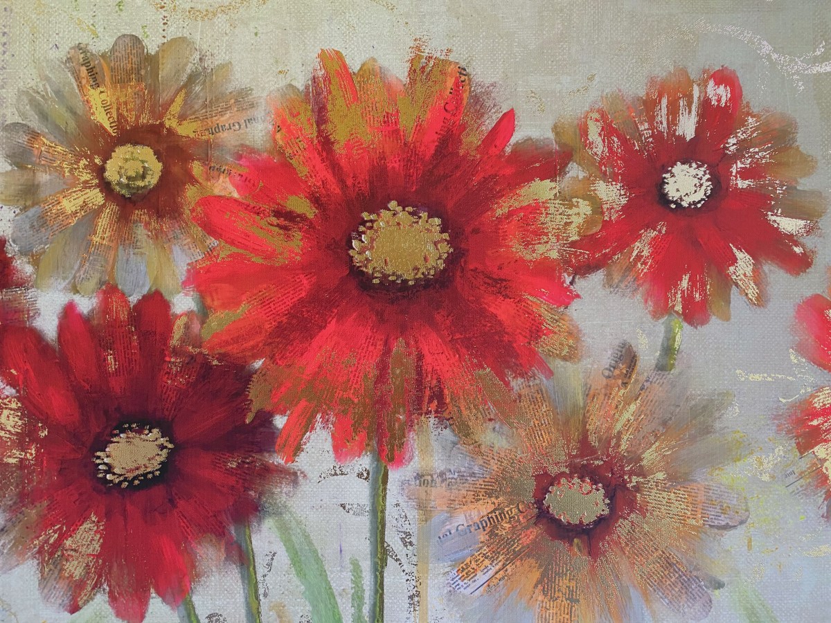
Pictured here is a photo display my mother keeps on her bedside table, featuring her sweetheart. To keep the connection alive and thriving, Mom and Jermaine talk on the phone multiple times throughout the day. Mom and Jermaine occasionally meet in Atlanta, and Mom keeps the hotel keys corresponding to their trips as a sweet reminder. Yes, every key. To remind herself of Jermaine and his scent, my mom keeps his shirts near her bed and even sleeps in them from time to time. Recently, for Valentine’s Day, Jermaine sent my mom a beautiful bouquet of flowers. Nearly two weeks later, the flowers are still proudly on display.
Love isn’t easy. It’s even harder when your lover can’t be right by your side. Despite these odds, my mom and Jermaine somehow, someway have figured out a routine that works for them. Their distant love is most certainly something straight out of a Marvin Gaye song. Around each other, even if it’s through a cell phone, they are both incredibly happy – and that’s all that matters to me.
This week, I embarked on a brand new multimedia journey. The mission: to create a video out of still pictures, natural sound and a voiceover by yours truly. I will not lie to you guys and tell you that this project was easy. I can, however, confidently say that it was very rewarding. Something about putting together a whole video production from scratch – from taking the pictures to recording the voiceover a million times to waiting in the Florida heat for hours just to get that perfect sound bite- truly makes me feel like a real-life journalist. The final product ended up being about how starting my garden led to my own personal growth and development. Take a peek at my creation below.
In this video, I use my garden to explore the tedious process of personal growth.
This week’s assignment was a treat, hopefully for both me as the creator and you guys as the audience. The task was to make a video out of still photos using the platform Animoto. Although I have done this sort of thing before in a previous course, this time around felt like a whole new experience.
I worked to create a story out of only twelve images, which is a lot harder than you may think. The narrative I chose to tell was a video diary of my visits to my dad’s house, who lives an hour and half away from my mom, where I mainly stay.
In this vlog, I talk about my experience making a video out of still photos and why I chose the topic that I did.
My parents are divorced. So, I thought it would be interesting to show that experience from the child’s perspective. As much as I am accustomed to it now, I recognize that traveling almost two hours to visit your dad is not normal for everyone.
Thus, I decided to shed a little light on my personal situation while also relating to children of divorced parents everywhere. You can watch my video below:
In this Animoto video, I use pictures to document my trip from my mom’s house to my dad’s house.
I hope you enjoyed watching my video as much as I enjoyed making it. As I said in my vlog, I encourage you to try it out for yourselves. Take a couple pictures, add some text & audio, and see what magic you can come up with.
Seriously, though, I’ve had a lot of questions about the wondrous world of vlogging, or video-logging, for those who need a refresher on their internet lingo. It’s not that I don’t know what they are – I do. I just didn’t quite see the intrigue behind them, likely because my image of them was corrupted by YouTubers who documented literally every second of their day. That just doesn’t excite me.
However, as I am becoming a better-informed journalist, I am starting to see the appeal in vlogging. They provide yet another platform for storytellers to appeal to a new audience and express their thoughts on camera. Thus, I am embarking on this vlogging journey with a positive mindset.
This is how excitedly I will now approach my new vlogging mission. Just picture my iPhone in the place of Will Smith’s fancy camera. I’ll get to his level one day. Via giphy.
While in the past, I might have answered not to vlog, these days I am hopping aboard the vlogging train. What’s the worst that could happen.
In my very first vlog on this site, I discuss my expectations for my new journey and explain why my opinion of vlogging is beginning to change.
Thank you for tuning in to my first vlog. I hope you stick around.
As stated in my About Me page (bonus points if you actually checked that page out before coming on over to this first blog post) this entire platform was created for my digital media storytelling course at Howard University. Thus, in honor of this site’s origins, I’d like to dedicate my first post to briefly discussing my experience in this course thus far.
So far, I am seriously loving this course. I really enjoy learning real-life skills that I can add to my proverbial backpack as a journalist. From day one, we have been able to get acclimated with different tools that make great online content stand out. One of my biggest take-aways from the beginning lectures is the importance of good audio. When you are putting together an online video package, you want audio that is as equally compelling as the visuals. Film experts like the Los Angeles Film School even suggest that audio is more important than its visual counterpart. No audience member wants to strain at their screen in confusion as they try to figure out what you are trying to say.
The last thing you want is for your audience members to be forced to act like they are a part of a Verizon commercial. “Can you hear me now?” via Giphy.com
I also enjoy how easy-to-follow the course is, up to this point at least. The lectures are both informative and highly understandable. The same goes for the tutorials, whose ease has allowed me to create this very platform that you are reading this blog post on right now. Although skills like website-building can be quite troublesome to acquire, the tutorial provided in class did such a comprehensive job of covering every basic detail needed to know when it comes to web design. Dr. P, the instructor of this course, did a great job of making sure her students were sticking with us and that no one was left behind. The use of sharing the screen of another student so that we could see in real-time what needed to be done to complete each step really helped in my understanding, especially since I am a visual learner.
The way in which Dr. P instructed our web design tutorial reminded me of the “No child left behind” campaign, or at least its namesake. Dr. P really ensured that no one was left behind when she was giving out the steps to create a website. Image via Avisca.com
Just as the lectures are highly helpful, the assigned readings for this course are also great for learning the ins and outs of being a well-informed journalist. The first reading was a study entitled What is Happening to Television Newsby Rasmus Kleis Nielson and Richard Sambrook. The study was very insightful in informing me about the current trends in media consumption as newer generations switch from loyal and avid TV-watchers to consumers of various forms of online media. This change has forced TV news sources to adapt to this growing technological world and mold their content into other platforms outside of the television, like social media and digital streaming sites.
This insight was surprising on some levels. Although I was aware that more and more media consumers are relying on their cell phones and portable tablets, and thus are using social media platforms like Facebook and streaming sites like Amazon Prime more and more for their news needs, I did not know this transformation was impacting the television news field as much as it actually is.
As more and more people, especially younger generations, are spending more and more time on their cell phones, they are beginning to rely on online platforms for their news.via Giphy. com
As you can likely tell, I have already been impressed by this course and am looking forward to future class sessions. My expectations for this course are high, or shall we say great, as I am anticipating more information-packed lessons and useful tips that are incredibly important for any rising journalist to know. Especially for someone like me, who loves learning something new every day, I am grateful for the opportunity to increase my knowledge.
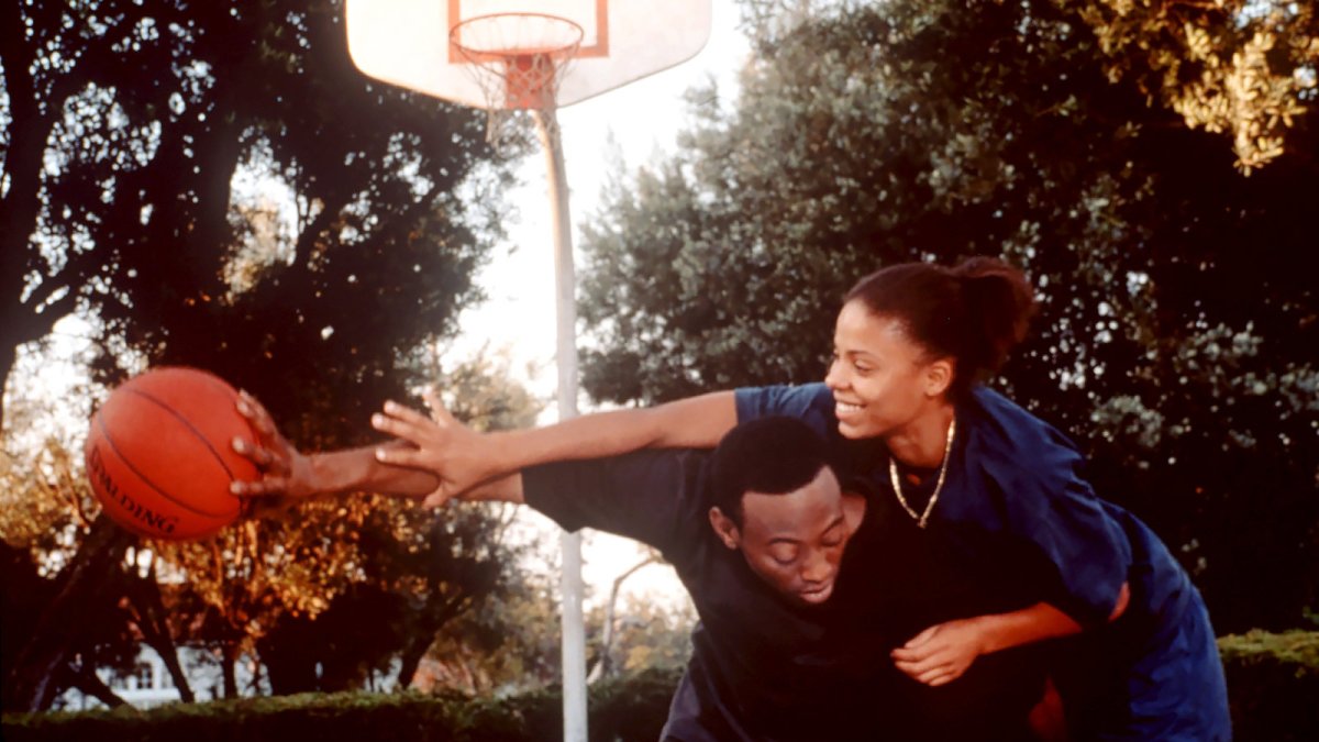
Growing up, I was obsessed with cheesy romance movies. The kind where the girl stumbles into the guy’s life in a spontaneous meet-cute and BAM- they’re in love. However, these films were almost always starring white leads and looking back, portrayed highly unrealistic depictions of relationships.
Thus, I decided to make an interactive timeline exploring romance films that I could both better relate to and that were much healthier portrayals of what love should like. The films I analyzed all featured Black characters, showcasing the beauty that is Black love. I enjoyed discussing the mere diversity in Black stories that I found in the movies I selected. It proved that our love doesn’t look the same, and quite frankly, doesn’t fall together perfectly like they do in Lifetime movies. Yet, they are beautiful nonetheless.