Featured image via Pexels
This week’s post is all about photo composition. For those who snoozed during photography class, this means I played around with the different components of a photograph and tried out techniques to make my photos a little more captivating. As classic as a good center-subject photo may be, it can be much more rewarding to explore new and unique ways to visually display elements. Don’t believe me? No worries, allow me to show you.
Technique 1: Symmetry A.K.A The Copycat
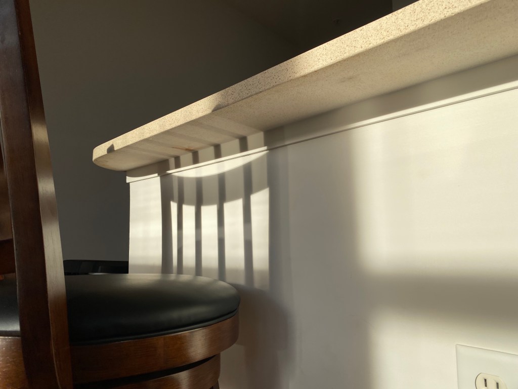
By capturing the shadow of this high-rise dining chair, I was able to create symmetry within my photo. The chair’s reflection against the wall depicts a perfect mirror of the design structure, appearing almost as if the chair is looking back at itself. For this picture, I had to wait for the perfect time of day, Golden Hour, when the sun was just about to set for the shadow to come out just right.
Technique 2: Rule of Thirds A.K.A Everything’s Better in Trios
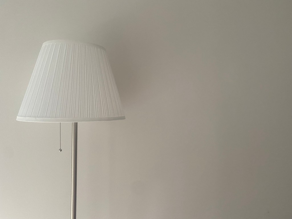
This photo utilizes the rule of thirds to capture the image of a lamp. Instead of putting the lamp in center frame, the subject is actually slightly to the left, making better use of the negative space to the right of the subject.
Technique 3: Leading Lines A.K.A Follow My Lead
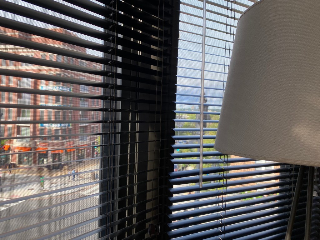
This photo was taken using the concept of leading lines. The horizontal lines created by the window blinds created a direct path to the subject of my photo, which is the lamp. Thus, by using the natural lines in the image to my advantage, I was able to easily guide viewers’ eyes to the main element of the photo.
Technique 4: Rule of Odds A.K.A Let’s Not Get Even

The rule of odds is used in this image of three chairs, as the subject count for the photo is an odd number. This creates a more visually-appealing composition compared to an even-numbered amount of subjects. The three chairs are able to be evenly distributed across the space and allows for a more satisfying look. To show all three chairs, I had to lean to the right of the last chair in line and point my camera across the row to fully capture all subjects.
Technique 5: Rule of Space A.K.A Back Up & Give Me Space
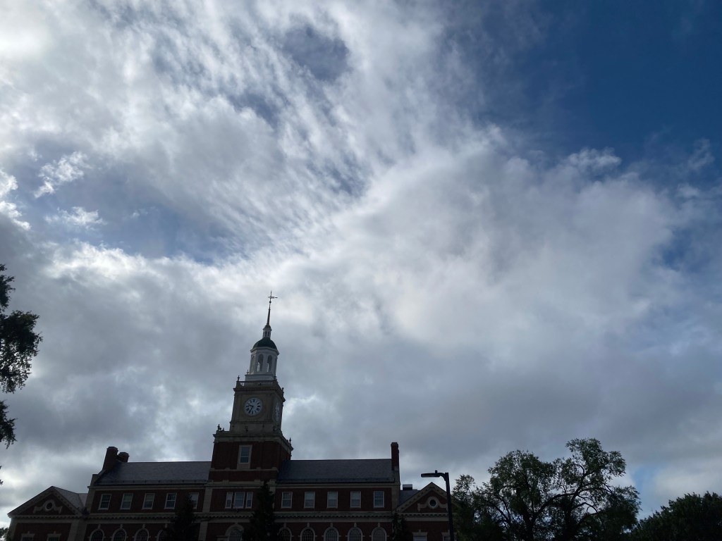
This photo utilizes the rule of space as there is negative space towards the top of the tall building. Thus, as viewers’ eyes travel upwards, they are met with a visually-appealing amount of space in the direction that the building is “growing” or standing erect from the ground. This photo also uses elements of juxtaposition as the building’s brick design is contrasted against the cloudy sky. To get this effect, I had to lower my own body and point my camera directly up to fully capture the building and the sky above it.
Technique 6: Left To Right A.K.A To the Left, To the Left
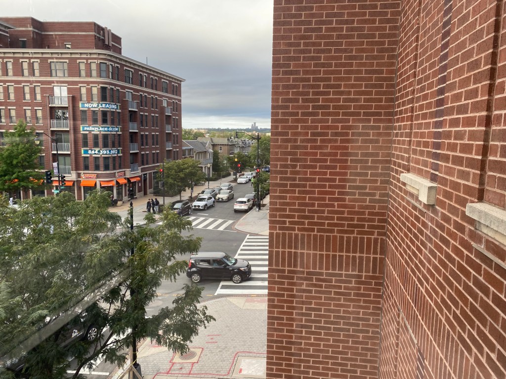
This photo utilizes the left-to-right technique to capture a car traveling down a busy road. The car is captured on the left side of the image and is traveling towards the right, which mimics the natural flow of how viewers’ eyes would study the photo. The car is also framed by the tree on the left and the brick building on the right. This birds-eye-view photo was taken at an elevated angle to fully capture the whole street scene.
Technique 7: Simplicity A.K.A Don’t Overthink It
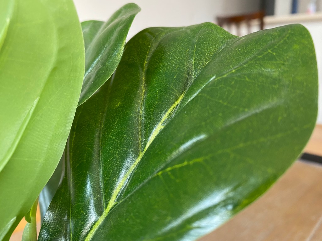
This image uses the simplicity technique to focus on a single leaf of a decorative house plant. By zooming in on a single aspect of a subject, I am able to focus more on the details of the plant and less on any background clutter or negative space. I had to get up close and personal with this plant, continuously adjusting my focus so that the details of the subject were captured.
Technique 8: Foreground Interest / Depth A.K.A More than What Meets the Eye
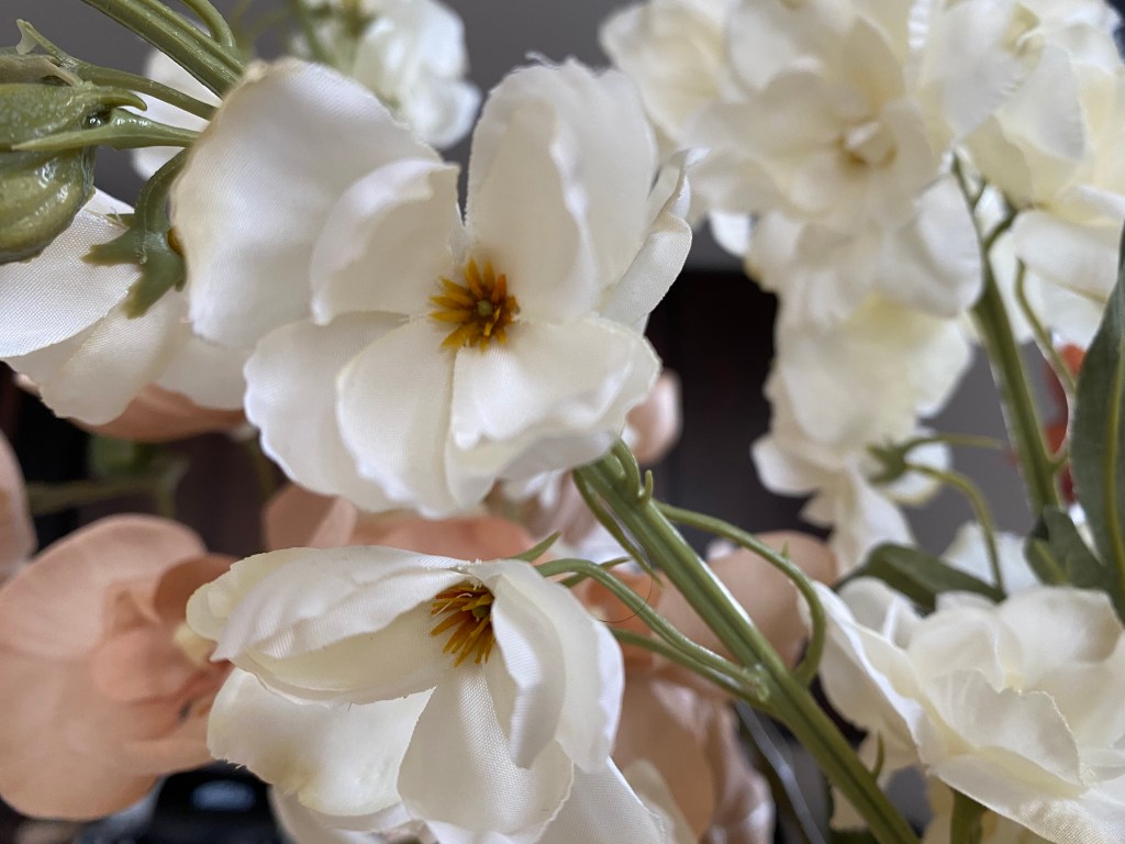
This image uses the power of foreground to create depth within the photo, adding context and visual clues. While the surrounding flowers are visible in the background of the photo, the focus on the white flowers in the foreground make it clear what the subject of the photo is. Still, the surrounding flowers add depth to the image and let viewers know the subject is part of an entire bouquet, rather than standing alone. This photo called for me to test different focus and zoom settings until I got the shot that caught both the pink and the white of the bouquet.
Technique 9: Frame within a Frame A.K.A Inception

For this photo, I was able to use the opening of a coffee table to frame the image of an entertainment center. The T.V set was surrounded by the legs, the top and bottom of the coffee table, creating a frame that perfectly enveloped my subject. This shot called for me to get on my knees to perfectly frame the television at an upwards angle.
Technique 10: Change of Angle A.K.A Perception is Everything
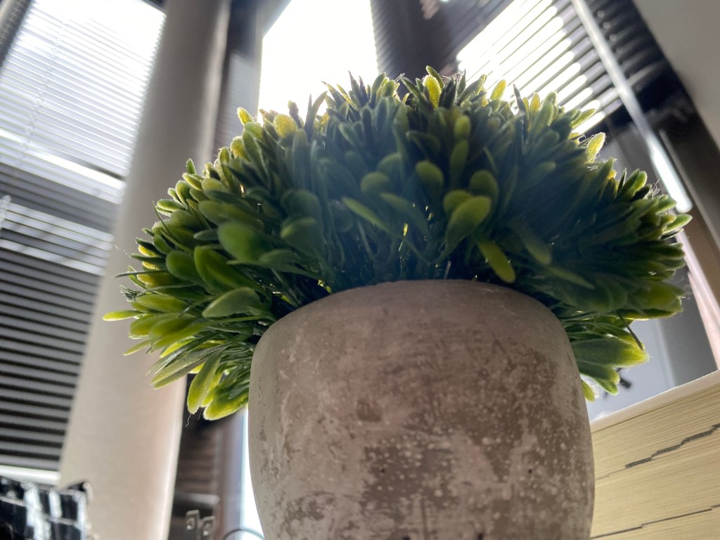
This photo was taken from a bottom angle, which completely changed the appearance of my subject. Although the potted plant is rather small in nature, by capturing it from a bottom angle I was able to make it appear much larger and as if takes up more space than it actually does.
Hopefully these photo composition techniques allow you to see the fun in experimenting when taking photos, rather than sticking with the same old snap shots. Next time you find yourself ready to capture a moment, feel free to move around a little and see just how much you can accentuate the components of your image.
