
This week, I embarked on the incredible journey of mastering the art of infographics.
For those who are unaware, an infographic is a comprehensive visual that informs an audience on some topic or phenomenon. Good infographics clearly educate in a way that is aesthetically pleasing. This means that most infographics do not use too many words. Instead, they rely on charts, graphs and visual representations of data to tell the story.
As for making my own infographic, there were some key points that I kept in the front of my mind. The first being: do not over-clutter your infographic. There is nothing worse than a graphic where every single inch of space is covered in either text or image. When I view a graphic design that is visually overwhelming, I am in no way whatsoever inspired to continue reading. Since this is the very last response I would want from my audience, I specifically focused on relaying just the right amount of information.
This was a little challenging given my infographic topic was exploring the demographics behind the top ranked public schools in the nation. As you can likely presume, there are a lot of demographics that accompany national school rankings. Thus, my job was to figure out what exact message I wanted to focus in on, and only provide statistics that corresponded with that narrative.
For my graphic, I chose to highlight how minorities and the poor tend to get the short end of the stick when it comes to quality education. I did this by showing the small percentage of minority students in the top 5% nationally ranked public schools. Of hundreds of schools, only around 30% of them had a minority enrollment of 25% or more. As disappointing as this statistic is, it was unfortunately not surprising to me.
I went to quite a highly ranked high school and it was no secret that our student population was majority White. Thus, the fact that this is a nationwide trend is not something I didn’t see coming. The hard truth is that oftentimes minorities do not have access to the same resources as their White counterparts, which means they are stuck with institutions of lesser quality and no access to a better alternative.
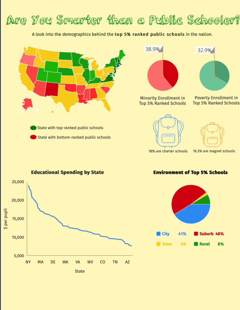
When looking at the data for minority enrollment of at least 50% in these top institutions, the numbers are even more sad with a percentage of around 20%. This means that the overwhelming majority of students in these top schools all look the same for the most part. As diverse as this country is, it’s a shame to see only one race get the majority of access to the ingredients for success and prosperity.
I also highlighted the role of money in good education as my graph showed that the states with the highest ranking schools were the same states who spent the most on education funding. Hence, in order for a school to do well, the state has to be willing to invest in its education system. This explains why poorer states in the South were towards the bottom of the ranking while richer states like New York were towards the top.
I was actually quite surprised at the disparity between the differences in state funding per student. At the higher end of the spectrum, the numbers climbed near $20,000 (per student) while other states spent less than $10,000. This gap brings to light how some students are put on uneven playing fields from the very beginning of their academic careers.
While students in affluent areas are receiving the benefits of thousands of dollars invested in them, students with less state funding must settle for the few resources available. This puts differences in academic performance into perspective as it is easy to see how someone with access to thousands of dollars of technology has the potential to perform much better than a student who can barely afford school supplies.
Finances continued to play an important role in the demographics behind the students at these top-ranked schools. Just as minorities were few few in number at these schools, so was poverty enrollment. I included the statistic showcasing that the poverty enrollment in the top 5% ranked schools was around 30%. This means the majority of the students in these high-ranking schools do not come from poverty which hints that social status and financial income play a big part in the quality of education.
For those in poor living situations, it is much harder for them to afford the luxury of quality education. Oftentimes, highly-ranked schools require a sizable tuition payment which is something not everyone can afford, especially when other expenses like groceries and rent are at the forefront. Even top-ranked public schools without a tuition requirement are often in high-income neighborhoods or communities, making them less accessible for someone who lives in a poorer community and does not have the means to travel for a better education.
Throughout the whole process, I learned more about what it takes to be a top-ranked school and gained a better understanding of what type of students are at these schools.
Feel free to view my infographic here.
